Responsive design
Slide

Responsive design

Responsive design

Responsive Design

Responsive design creates dynamic changes to the appearance of a website, depending on the screen size and orientation of the device being used. In responsive web design the main problem lies in designing for the huge variety of devices available ranging from phones to desktop monitors and everything in between.

Responsive web design uses breakpoints to determine how the layout of a site will appear. Whilst one design is generally used, one variation is used above a breakpoint and another variation is applied below that breakpoint. The breakpoints are usually based on the width of the browser.

The same content is served to all devices and CSS is used, dependent upon the device being used, to determine the layout of the webpage. Rather than creating a separate site for wide-screen monitors, desktops, laptops, tablets and phones of all sizes, a single codebase supports all devices. This has the added advantage of stopping errors from creeping in.

In responsive design, pages reshuffle in response to the device being used. For instance, in a newspaper or magazine website a three-column desktop design may reshuffle to two columns for a tablet and a single column for a smartphone retaining "viewability" without loss of content.

Whilst responsive design is a way to provide equal access to information regardless of the device being used it is also possible to hide particular items on smaller screens.

Responsive design has advantages over developing separate sites for different device types.

  1. The use of a single codebase can make development faster, compared to developing three or four distinct sites,
  2. It makes maintenance much easier, as one set of code and content needs to be updated rather than three or four.
  3. It supports new breakpoints needed at any time. If any given size device becomes popular, the code can support it. Responsive design does not tie design to a particular device.

Creating Usable Experiences

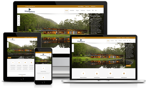
Because responsive design relies on shuffling elements around the page, design and development need to work closely together to ensure a usable experience across devices. Responsive design often turns into solving a puzzle — how to reorganize elements on larger pages to fit skinnier, longer pages or vice versa. However, ensuring that elements fit within a page is not enough. For a responsive design to be successful, the design must also be usable at all screen resolutions and sizes.

When elements move around the page, the user experience can be completely different from one view of the site to the next. It is important that design and development teams work together not to just determine how the content should be shuffled around, but to also see what the end result of that shift looks like and how it affects the user experience.

Fortunately a good content management system such as Joomla or WordPress takes care of most of these problems for you.

Responsive Design – Focusing on Content

Responsive design