Slide

Roadblocks

Conversion Roadblocks

Conversion Roadblocks

The reason for creating most websites is, either directly or indirectly, to make money. This means achieving a high conversion rate.

We all put a lot of effort into maximizing website conversions but is the effort being put in the right area?

It becomes very frustrating when visitors come to your website but are not converting. Listed below may be some of the road blocks which will cause your visitors to turn away.

Conversion Roadblocks

Poor visuals = Conversion Roadblocks

Online marketing is done through visuals and content, so the quality – not necessarily quantity – and type of images, colour choices and layout you use in your website assist in making conversions.

More than 90% of youe visitors consider the visual factors while making decisions. This means that you should be very selective with your visuals. If you are using unsuitable visuals on your website you are creating a roadblock and wasting your time.

The biggest turnoff for would-be customers is bad layout. If you want to improve conversions you need to make your layout as simple as possible. If you have a cluttered design you are encouraging your customers to leave. With a minimalist design you can put your visitors at ease and lower your bounce rate.

Color schemes play a more important role in conversion than you may think. You should choose colors for your layout based on the emotions you want to instill in your visitors.

Conversion Roadblocks

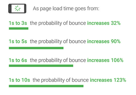
Slow loading times = Conversion Roadblocks

Nothing is more annoying than a slow loading web page. It is a major roadblock.

Bigger images also slow down the website, so it is recommended to reduce the image file size to prevent the images from increasing the loading time.

Look here to discover your page loading times.

Conversion Roadblocks

Poor copy = Conversion Roadblocks

If your website has a poor copy it could be the reason that your visitors are not taking the action you want them to take.

Poor copy is confusing, boring or maybe both and will create a roadblock.

The copy of your website should be persuasive, clear and, above all, not boring to make your visitor comfortable. Remember that what may be hugely interesting to you may be dead boring to someone else.

Conversion Roadblocks

Confusing navigation = Conversion Roadblocks

If your website is so confusing that it cannot take visitors where they want to go then you are forcing them to leave your website. Confusing navigation makes the user feel like they have nno direction and is a major roadblock.

Your website visitor should be able to easily navigate your site. It should always be simple and intuitive to decrease the bounce rate.

You should not include too many navigation items, as this puts a paralyzing effect on them and they get confused and leave.

Conversion Roadblocks

Multiple calls to action per page = Conversion Roadblocks

A call to action is a phrase or a statement that tells your customers to take a specific action.

It is the step-by-step direction for what you want them to do next if they are interested in your offer. Most people become confused if asked to think about too many things. Too many calls to action will create a roadblock.

Each landing page should be solely dedicated for one purpose and should have one goal for the visitors. Your website should have one compelling call-to-action per landing page.

A website with multiple call-to-actions will have far less conversions compared to one with a single CTA button. When you reduce the number of options it becomes easier for your visitor to make a decision.

Conversion Roadblocks

Annoying pop-ups = Conversion Roadblocks

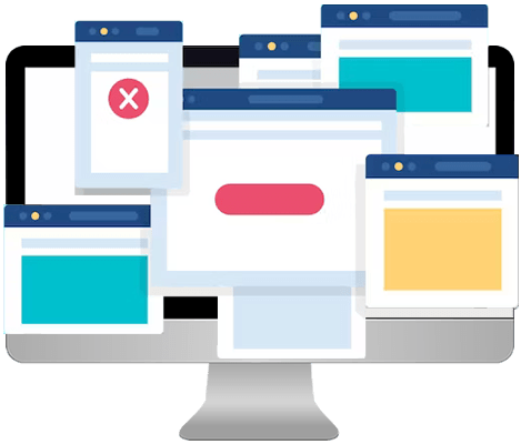
There is little more irritating than coming onto a new page and trying to fill out a search field and a pop-up interfered with the input. Think about the location of pop-ups and how many. Overuse will create a roadblock.

There can be a time and place for them but, like all bells and whistles, if they are not necessary don't use them.

Forms asking for unnecessary information = Conversion Roadblocks

There is a limit to how much information people would like to provide in a form. A form is impersonal and can be seen as an information gatherer where the information can be used for unusual activities. Ask only for that information which is essential. A form with unnecessary fields reduces the conversion rate. An example of an unnecessary field is a ‘Retype email address’ field in your signup forms.

Do not gather information for its own sake.

Keep it simple.